
Adventures in Value Creation: The Case of the Vanishing Project
Author: Johannes Traa
July 15, 2023
Overview
Adventures in Value Creation is a series of case studies in technology innovation and business. This article describes a project that initially appeared ripe with opportunity. However, after a year of hard work, various realizations combined to strip it clean of any business value overnight. The learnings from this mishap shine a light on imperatives for tech innovation: identify the real business problem, understand your criteria of success, and target failure modes.
The story
Promising start
While I was working as a research scientist at a tech company, an exciting opportunity came my way. It was a project with another group of technologists on a pattern recognition system that they had developed. Let’s refer to them as Logix.
I was tasked with leading a team of three researchers from my group in a collaboration with the Logix team. Our charter was to understand their existing system, and then explore enhancements that would take it to the next level. We had expertise in signal processing, machine learning, and algorithm development. They in turn had a working system and customer relationships.
We had some initial meetings, exchanged presentations, studied their code, created documentation, brainstormed algorithmic enhancements, and so on. It was a promising start.
The use-case
One month into the collaboration, they presented us with a challenging use-case: industrial fault monitoring. An automotive customer was interested in applying the Logix system to detect faults in their manufacturing process. So it was a real-time anomaly detection problem. Sounded cool.
Trip to the factory
We spent a week at the customer’s factory. It was a very large and impressive facility that cranked out one car per minute. The assembly line had two branches: one for building the chassis and the other for building the upper frame. There was a station where the two branches met at which the frame was welded to the chassis. They called it the “marriage point”.
Their head of technology development gave us a tour of the place, including a 1-kilometer-long pedestrian hallway. He then took us to a station on the line where parts of the fuel tank were assembled. It was enthralling to see how it was all laid out and optimized for efficiency. Observing operators do their work was eye-opening. We asked many questions, took copious notes, schmoozed with some line managers, and then went back to our hotel to start building.
We brainstormed ideas for what data collection system to leave with them. We realized that putting sensors at fixed points along the line made no sense because the operators worked along a 5-meter stretch. We needed sensors that would go where the operators went, so the implication was clear. We needed to capture data from a wearable.
We swung by an electronics store nearby, got a WiFi router, smartwatches, a SIM card, and a bunch of other gear. Then we started patching them together and writing the code that would wirelessly stream data from the watches (worn by the operators) to an Intel NUC connected to the router. We could then access the data remotely through an SSH tunnel.
We had just a few days to put it all together and needed to continue meeting and discussing ideas with the customer. So we hung out at the factory during the day and spent our evenings building and testing the system.
The algorithmic pipeline would extract insights from the data streams as to what the operator did and when. We could then use those insights to identify if any part of that assembly process had been performed incorrectly. Once deployed, the system would detect an anomalous pattern and alert the operator via a red light to double-check their work. If a green light lit up, they could move on to the next chassis coming down the line. This traffic light system was common at other stations.
We didn’t fully build the system during that trip, but we got most of it ready and were able to show some preliminary results. They of course found it exciting that we were able to produce something sensible, albeit basic, in just a few days. Upon returning home, our presentation about the trip went well, with much praise for our speed of execution as well as intrigue about the use-case.
Development
As data came in from the factory over the subsequent months, we built out a software pipeline to label it. We didn’t exactly know which patterns corresponded to which steps in the assembly process or even what the precise assembly steps were. But we knew that we were seeing a lot and that we could build out streaming algorithms for this setting. So we worked hard on all of that and kept the conversation going with both the Logix team and the customer.
ROC curves
Once we had a nice, labeled dataset to work with and a beyond-baseline model developed, we looked at our results and pondered next steps. We started by looking at how well the model could detect a pattern that we knew corresponded to an important component on the fuel tank. If we could accurately detect mistakes in the assembly step for that component, it would serve as a proof-of-concept that our system was doing something useful. So we tweaked the algorithm for this specific use-case and plotted the Receiver Operating Characteristic (ROC) curve (see Figure 1a).
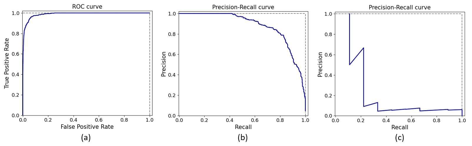
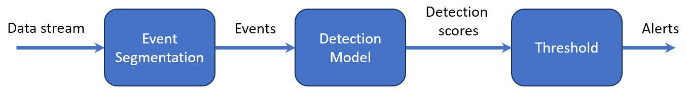
To understand what this means, let’s think through what’s going on here. We have a binary detection algorithm that tries to detect if a target pattern is present in the data. It consists of a transformation from a chunk of raw data to a detection metric between 0 and 1. The machine learning and signal processing “magic” is what performs that mapping (see Figure 2). If the pattern is there, the detection score should be high, otherwise it should be low.
The ROC curve displays the True Positive Rate (TPR) of our detection algorithm on the vertical axis and the False Positive Rate (FPR) on the horizontal axis. As you move the detection threshold up or down, your operating point in this graph shifts along the length of the curve.
If you set the detection threshold at 0.0, you’ll mark every event as a detection. You won’t miss any true positives, but everything else will be a false alarm (top-right corner of the ROC curve plot). On the other hand, if your threshold is set at 1.0, you’ll miss all the events you needed to catch while also avoiding false alarms (bottom-left corner of the ROC curve plot). A threshold somewhere in-between is best and represents our desired trade-off between TPR and FPR.
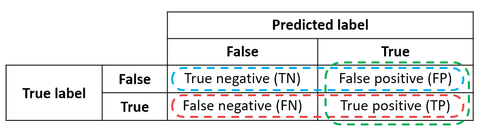
Each point on the ROC curve is determined by the confusion matrix of the algorithm for that threshold (see Figure 3). There are four quadrants because there are two possibilities for the ground truth (pattern is there or not) and two possibilities for our detection output (we report that the pattern was detected or not). The better our algorithm is at mapping raw data to an accurate detection score, the more examples will be concentrated on the diagonal of this matrix.
Realizations
The ROC curve is a very common tool for visualizing detection model performance and Figure 1a looks great! A curve that hugs the top-left corner is what we like to see. Definitely something we would want to present to stakeholders. But then came a set of damning realizations.
We realized that the event we were trying to detect was not the pattern we had labeled in the data, but rather its absence. When an operator failed to assemble a component properly, the corresponding pattern in the data would simply not be there. We had neither examples of that absence nor a feasible proposal for acquiring such examples.
We also noted that ROC curves display two metrics (TPR, FPR) that are not influenced by how rare the event is! They are calculated from either row of the confusion matrix, while the rareness of the anomaly is captured by the ratio of the row sums.
Operators rarely made mistakes because they were well-trained. This implied that what we should actually be looking at is the precision-recall (PR) curve, which displays precision (fraction of detections that are true positives) versus recall (a.k.a. TPR). We decided that we could scale up the first row of the confusion matrix to translate our event detection results to those for absence detections so as to account for the rareness of mistakes.
We discussed this with the customer and they estimated that operators messed up at a rate between 1 in every 1,000 (worst case) and 1 in every 10,000 (best case) assemblies. The precision-recall curves when accounting (and not) for rareness are shown in Figures 1b and 1c. The PR curve for best-case operator performance looks completely unusable.
To top it all off, they told us that it would save them about $50 for each mistake our system caught and that they wanted to catch at least 80% of the faults. At that recall level, our precision was probably around 20%! In other words, when our system would alert the operator, it would be wrong 4 out of 5 times on average.
We would never be able to add value for this customer given (1) the real use case (detecting absences of patterns), (2) how rare faults were in practice, (3) how negligible the cost of faults was, and (4) how annoying false alarms would be and thus how often operators would ignore them. Plus, we reasoned that the mere act of strapping sensors to operators’ wrists would make them more vigilant, further reducing mistakes. Even if we had a truly amazing model, this customer still wouldn’t benefit from it.
Once we realized that there was no there there, we followed the norm for wrapping up a research initiative. We packaged our results in a flashy PowerPoint presentation, showed it off at an internal conference, which was met with enthusiastic applause, interesting follow-up questions, and many complements, and quietly moved on to other projects.
Conclusion
So, what does this all mean? That is, other than that we should never trust ROC curves ever again. There are three main implications for technologists and a few take-aways for leaders of technology innovation initiatives.
Implications for technologists
1. Identify the real business problem and translate it into a technical problem
If you do your homework up-front to identify what the actual business problem is, you can determine if the project is worth pursuing at all. We were so enamored with the collaboration and use-case that we failed to ask some critical questions early on. Andrew Ng touches on this in the first course of a Coursera specialization about operationalizing machine learning pipelines (Ng, Crowe, and Moroney, 2021). Clarifying the business problem is a first priority in any new project.
2. Know your metrics of success
If you can pin down a performance criterion for your system that measures what really matters, you’ll be catapulted ahead. We realized what the true criterion was very late. John Doerr does a nice job of covering this point in the book Measure What Matters (Doerr and Page, 2021).
3. Understand the triggers for pivoting or cancelling a project and then target them
If I can show that a project, as it is currently framed, creates no value for its customers, we can confidently pivot or cancel it entirely. Karl Popper famously stated that a good scientific theory is characterized by its falsifiability (Popper, 2002). I now insist that the central premise of any project I work on be falsifiable. Furthermore, I actively drive the work forward so as to efficiently target its demise. If we expect fewer than 10% of initiatives to generate revenue, repeatedly going for their jugulars is an obvious business necessity.
Take-aways for leaders
We set out on an adventure with many tools in our belt and smiles on our faces. We were rewarded in the end, not with a paying customer, but with valuable lessons about how to efficiently conduct technology innovation. Nowadays, in any new project I join, I ensure that the business problem, criterion for success, and pivot/kill switches are all well-defined. If they aren’t, I push to make them so.
Why do I feel so strongly about this? Because I recognize the intangible side-effects of getting these things wrong. Talented employees who don’t see their work go anywhere feel disheartened, lose motivation, and leave for departments that seem to be better managed. I’ve seen exceptional talent driven out this way multiple times. The good thing is that anyone can take initiative by voicing their concerns and investigating weaknesses in a project's premise.
I enjoy experimenting with data and AI as much as the next developer, but I’ve matured as a technologist over the years. I now see that effective leadership requires taking a cold hard look at what we’re really after: creating business value. Technical value should always follow, not lead.
Work smart,
Then hard.
Your people will thank you.
References
Doerr, J. and Page, L. (2018). Measure What Matters: How Google, Bono, and the Gates Foundation Rock the World With OKRs. Portfolio.
Ng, A., Crowe, R., and Moroney, L. (2021). Machine Learning Engineering for Production (MLOps). Coursera. https://www.coursera.org/specializations/machine-learning-engineering-for-production-mlops
Popper, K. (2002). The Logic of Scientific Discovery. Psychology Press.